
Here we’re going to build an animated header that disappears when the user scrolls down the list and reappears when the user scrolls back upwards. Also, the header will have a sticky bar that will be there all the way around, no matter where the user is in the vertical list.
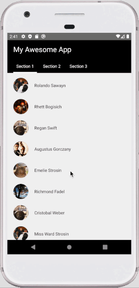
This effect is pretty standard and commonly used in mobile apps.
Without further ado, let’s start the tutorial:
Container Component
Here we will go with a classic approach. Putting the header component out of the scroll container and position it with absolute style property.
This will cause an overlap between the header and scrollable content. So the Animated.ScrollView will need a:
contentContainerStyle={{paddingTop: this.state.headerHeight}}Therefor we need to measure the headerHeight as well. For this to happen, we will pass an onLayout callback function to the header component and will call it inside CollapsibleHeader component later on:
onHeaderLayout = (headerHeight) => {
  this.setState({
     headerHeight,
  });
};
// A bunch of code we don't need yet
render() {
  // A bunch of components and props again not needed yet...
  <CollapsibleHeader
  // A ton of props we don't care about yet...
  onLayout={this.onHeaderLayout}
  ..
  />
}
And to trace the scroll, we will use this function:
onScroll={Animated.event(
  [{nativeEvent: {contentOffset: {y: this.scrollY}}}],
  {useNativeDriver: true},
)}
Which scrollY is an Animated value defined at the top of the container component:
this.scrollY = new Animated.Value(0)You can check out the completed container component here.
Collapsible Header Component
Our CollapsibleHeader component will need to know about the scroll value to work. Therefore we will add this prop to the component which is in the container component:
scrollY={this.scrollY}onLayout function
Remember the onLayout callback from the previous section? Here’s where we’re going to define the function itself and fetch the required values and eventually inform the parent about it:
onLayout = ({
  nativeEvent: {
    layout: { y, height },
  },
}) => {
  this.setState({
    layoutHeight: height,
  })
  this.props.onLayout && this.props.onLayout(height)
}
First, we will pass this function as a prop to the wrapper Animated.View component, which navigates the animated transformation while scrolling the content.
Next, we’re fetching the height of the header component and putting it in the state to use later for transformation.
diffClamp function
Now, One of the crucial steps of achieving our desired animated effect comes to play: The diffClamp.
To understand what does this Animated function does, let’s start with clamping itself.
Clamping
In computer graphics, clamping is the process of limiting a position to an area. In general, we use clamping to restrict a value to a given range. Wikipedia
The pseudocode for clamping is more intuitive to understand:
function clamp(x, min, max):
    if (x < min) then
        x = min
    else if (x > max) then
        x = max
    return x
In our case, x would be the scrollY value, obviously. But this simple clamping is not enough.
This function would only limit the exact scrollY value. It would’ve been desirable to only display the header on the top of the page. And then hide it when the user scrolls past the header height.
But what we want is to reappear the header when the user drags downwards and goes up on the list.
In a way, we can say we don’t care about the raw scrollY value. We care about how much it’s changed compared to a moment ago.
This functionality is what diffClamp does for us. This function internally subtracts the two continuous scrollY values and feeds them to the clamp function. So this way, we will always have a value between 0 and headerHeight no matter where on the list.
How to calculate the diffClamp?
We will calculate the clampedScroll value in the componentDidUpdate():
componentDidUpdate() {
    const {scrollY, stickyHeaderHeight} = this.props;
    const {layoutHeight, clampedScroll} = this.state;

    if (stickyHeaderHeight && layoutHeight && !clampedScroll) {
      this.setState({
        clampedScroll: Animated.diffClamp(
          scrollY,
          0,
          layoutHeight - stickyHeaderHeight,
        ),
      });
    }
  }
So let’s see what’s going on here. Shall we?
We set the min value equal to 0. We want the calculations to start at the top of the list when the user has made no motion yet. And we stop the range when the user scrolls about the height of the header. Since we want to display the sticky bar all the way around, we’re subtracting the height of the bar here.
Fetch stickyBarHeight in the CollpsibleHeader component
To get the sticky bar height, we’ve got several solutions. The solution used here exposes the setStickyHeight method to the parent, and the parent passes it to the sticky bar component.
Then this function gets called in the TabBar component’s onLayout function eventually and gives us the height. We will go over this in more detail in the next section.
Another approach would be calling the setStickyHeight method in the ComponentDidUpdate() when the stickyHeight prop is available through the parent.
Rendering the animated header
Phew! And we’re done with clamping! So let’s move forward to using what we’ve calculated. Now we’re in the render method finally!
We’re going to change the translateY value of the wrapper View. Meaning moving it upward and downward.
We need a negative translateY value equal to the layoutHeight - stickyHeight to move it out of the view. And vice versa to display it again.
The relationship between the clampedScroll and the translateY is equal but reverse in direction.
So we just need to reverse the calculated clamped scroll value. Since we want to hide the header when the user scrolls down, (Thus, the scrollY value increases). And we want to display the header as soon as the user scrolls up. (therefore decreasing the scrollY value).
And this is how it’s done:
const translateY =
  clampedScroll && layoutHeight && stickyHeight
    ? Animated.multiply(clampedScroll, -1)
    : 0
Another approach would be using the interpolate method.
Wrapping up
And that’s it! Now our animated value is generated and it’s ready to be used. All we need to do is to pass it in the style array, alongside the onLayout prop:
return (
  <Animated.View
    style={[styles.container, { transform: [{ translateY }] }]}
    onLayout={this.onLayout}
  >
    {this.props.children}
  </Animated.View>
)
Also since we use the absolute positioning for the header component, we’re going to use this container style:
container: {
    position: 'absolute',
    top: 0,
    left: 0,
    right: 0,
    backgroundColor: 'black',
    zIndex: 10,
  },
You can check out the completed collapsible header component here.
Sticky Bar Component
Now we’re in the final step, which is writing the sticky bar component. Again, this component is an elementary one just to demonstrate the effect.
In our case, this component will be the child of <CollapsibleHeader> component. As such:
<CollapsibleHeader
  ...
>
  <Text style={styles.sectionTitle}>My Awesome App</Text>
  <TabBar onLayout={this.onStickyHeaderLayout} />
</CollapsibleHeader>
As you see we only need to pass the onLayout callback function of the parent. Which is similar to the one we’ve used for the CollapsibleHeader component:
onStickyHeaderLayout = stickyHeaderHeight => {
  this.setState({
    stickyHeaderHeight,
  })
  this.header?.current?.setStickyHeight(stickyHeaderHeight)
}
In the second section, we’ve discussed the setStickyHeight function of the <CollapsibleHeader> and why we need it.
To have the height, the main wrapper of the <TabBar> component needs an onLayout function which follows the same patterns:
onViewLayout = ({
  nativeEvent: {
    layout: { height, y },
  },
}) => {
  const { onLayout } = this.props
  onLayout && onLayout(height, y)
}
You can check out the completed tab bar component here.
And finally
We’re good. We should have a smooth appearing/disappearing animation effect on our header component using the Animated API.
What do you think of this method to have a collapsible header component with a sticky bar? Let me know in the comments below!
In the next post, we will create the same effect with a set of whole new tools! First, we will rewrite the components as Function components. Then, we will use some custom hooks. And above all, we will use the new and fancy Reanimated V2!. Also, this time we will use the interpolate approach.
So if you’ve liked this one and are interested in the above topics, make sure to subscribe to my newsletter down here to be notified when the next post is shipped!